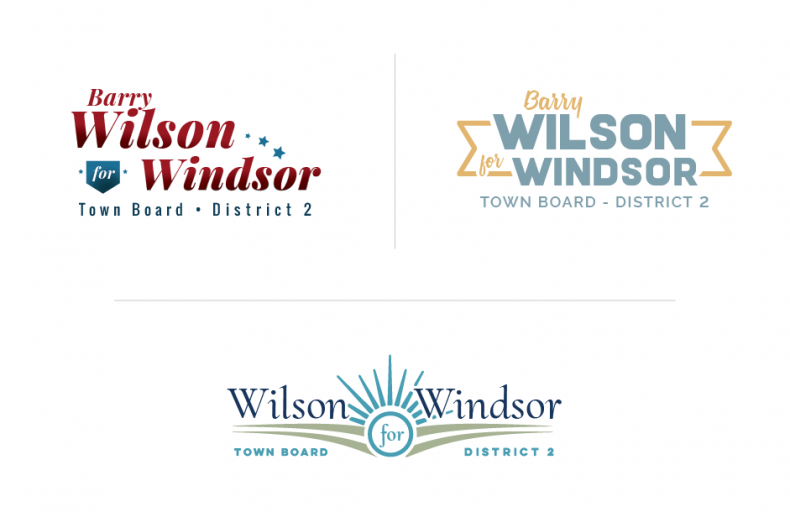
Barry Wilson was running for town board and asked me to help with the visual presence of his campaign. He wanted the logo to give the impression of being strong, approachable & honest. He wanted the logo to not represent a specific political party but to be more neutral.
After creating three unique compositions, we decided to use star motifs and a font that was strong but also had some character to it. Once the logo was created we used this on business cards, the webpage, and social media pages.


